|
|
Post by Ike on Apr 20, 2010 22:32:56 GMT -5
Something we were discussing in the chat today -- our resident Kitten was remarking on how absolutely unforgivably shitty the font used in Faxanadu is. Most of you are probably familiar with it. It looks kind of like this:  For example, that's obviously supposed to read "SUPERHERO," but the font makes it look like "SUPER NERO." As Kitten can attest, it made password taking difficult. However, I have a hard copy of Faxanadu that displays this font instead: 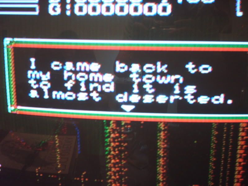 This is a photograph taken from my TV. Much cleaner font, a nice readable serif instead of that gaudy block letter crap. Apparently, two different versions of the game were released, but I don't think there's any significant difference in the packaging or label of the cart to distinguish one font-type from another. Just something interesting I noticed, I hadn't seen any other place comment on it. |
|
|
|
Post by ReyVGM on Apr 20, 2010 23:52:40 GMT -5
I checked the ROMs and there are two versions, PRG0 and PRG1.
Both versions have the same upper case font (and the problem with the upper case H).
PRG1 has the font in the second pic (from your TV) and PRG0 has a different set of fonts, but it's nothing major.
|
|
Deleted
Deleted Member
Posts: 0
|
Post by Deleted on Apr 21, 2010 2:16:15 GMT -5
|
|
|
|
Post by ReyVGM on Apr 21, 2010 6:45:17 GMT -5
Actually, that site omitted the PRG1 version. Apparently they used that version as the basis for the Euro one. So both the Euro and the PRG1 version have the same font.
|
|
|
|
Post by Sturat on Apr 21, 2010 7:07:40 GMT -5
Gotta love Jesus' disembodied forehead left floating in the western releases. |
|
|
|
Post by kitten on Apr 21, 2010 9:19:04 GMT -5
Gotta love Jesus' disembodied forehead left floating in the western releases. lol holy shit, that's hilarious. But seriously, though, the font I have for my cartridge (the original US font) sucks! I've probably spent a combined hour trying to figure out what the hell was wrong with some of my passwords. A "c" looks a lot like an "e." A capital "H" looks ridiculously similar to an "N." It's not too difficult to confuse "O" and "0." |
|
|
|
Post by thefunkyredcaboose on Apr 21, 2010 10:08:55 GMT -5
Threads like this are why I love this board so much.
|
|
|
|
Post by Ike on Apr 21, 2010 12:42:06 GMT -5
Does this mean I have a European Faxanadu cart?  |
|
|
|
Post by ReyVGM on Apr 21, 2010 13:05:16 GMT -5
Am I on ignore or something?
I already explained why the USA and Euro games have the same font.
|
|
|
|
Post by Ike on Apr 21, 2010 14:31:16 GMT -5
Sorry, somehow your post didn't register. :> <3 u rey
|
|
|
|
Post by ReyVGM on Apr 21, 2010 15:49:09 GMT -5
laffing out loud
|
|
|
|
Post by kitten on Apr 22, 2010 14:17:34 GMT -5
Oh man this thread has made my day much better as is. Faxanadu is without doubt the game that shaped my taste as a kid, most of the stuff I like now won't have been possible without it. Second to having a NES as a birth day present, this comes up as one of the best ones I ever had. There is one thing that has been driving me nuts, the girl who talks about the magic shield in the last misty town gave me one free years ago, but not once ever since I got a free suit of armor from guy that people apparently commonly don't get one from  I looked that up online and apparently if you're wearing it while talking to another NPC, they talk about it being dirty or something lol. |
|