|
|
Post by Dee Liteyears on Sept 18, 2016 15:45:33 GMT -5
The EU/JP SNES just looks super sleek, like it says "A new era of console gaming is here" Saturn looks good in almost every variation, though the white and clear ones are definately the coolest. Also the Sega Multi Mega, just love that 90's HiFi look. It's only surpassed by this beauty  |
|
|
|
Post by toei on Sept 18, 2016 16:03:59 GMT -5
 The Master System III, released by Tectoy in Brazil. It would look better with a Sega logo rather than Tectoy, but I like the looks regardless. Never seen one in person, I was just browsing around for console pics and this came up. Also, I'm surprised at all the Snes love. One of the greatest libraries of games ever, great console, but the actual design is hideous, especially the North American version. Blocky and light gray. It looks like a cheap robot part. |
|
|
|
Post by stealthRUSH on Sept 18, 2016 17:57:49 GMT -5
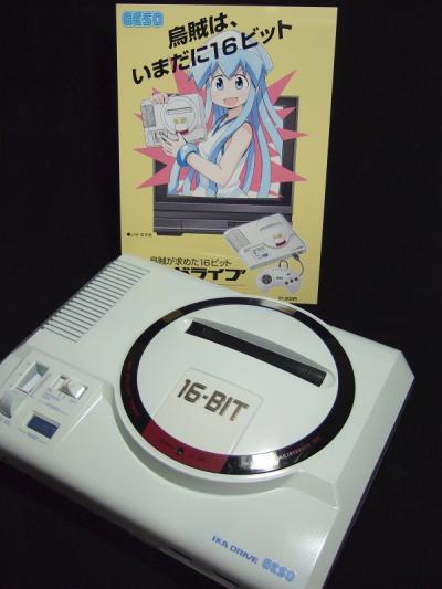 My personal top 10 in no order (consoles): -pc engine -pc engine cd-rom² -pc engine duo r/rx -sega saturn (jpn) -sega dreamcast -sega mark III -sega mega drive -family computer -super famicom -pc-fx |
|
|
|
Post by personman on Sept 18, 2016 22:39:41 GMT -5
I seem to have a fondness for the compact redesigns of most home consoles. I really liked the SNES redesign:  The Genesis 3: 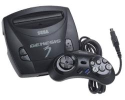 The top loader NES looked better, worked better, and I thought the 'dog bone' controller it came with was just adorable:  I get a kick out of the Sega CDX for some reason. Maybe because it was supposed to be 3 console in 1 technically (though its only two since the 32x wont fit on it of course.) 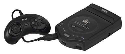 Someone already mentioned the PSOne but I'm posting it again because the thing is adorable. And I liked the lighter color scheme it all had. Made it seem really new and nifty.  And while its not really a looker I find the compact PS2 really amusing just for how much smaller it is compared to the original. Night and day difference. 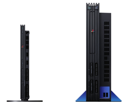 I would have to say though that my absolute favorite design of a home console is the newer 360. With the gloss finish and the faux chrome or what ever I really think the thing looks great. Much better than the Xbone but I like things rounded off rather angled and what not:  So yeah, perhaps not the best looking stuff but I personally find these the most interesting. |
|
|
|
Post by elektrolurch on Sept 19, 2016 6:13:58 GMT -5
I know, I know, those aren't consoles, but: I really like the look of many home computers from the 80ies. And since they were mainly used to play games, I think they deserve a mentioning in this thread: 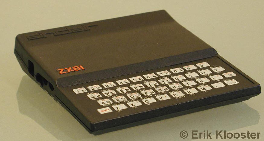 On images it doesn't really seem that special, but like the 2600Jr, I love this unit for being so small, light and retro-futuristic looking, like it belongs in a late 70ies/early 80ies scifi movie. The keyboard sure is a pain to use, but it just looks so cool. 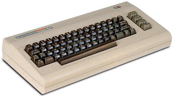 Iconic. Simply put. Yeah nostalgia plays a big part with it, but I love this kinda clunky design with the clunky keyboard and the rounded edges. Call me weird, but from this era, I like the look of home computers more than consoles. Aigan, nostalgia, sure. But they look less like toys to me. That's why I don't really like the look of the non-portable Nintendo Consoles (except the Famicom, maybe), they look so toyish to me. But all this is so subjective. I mean, I read negative stuff about the original 2600 design here. And to me, it is just amazing. So yeah, it is really difficult to argue about taste;) |
|
|
|
Post by llj on Sept 19, 2016 11:36:21 GMT -5
I hate the way all of Sony's consoles have looked (except Vita which was a portable anyway). But I put up with them cuz they're so dominant in this industry. It's kind of like when an athlete you don't like wins everything.
|
|
|
|
Post by Dee Liteyears on Sept 19, 2016 15:05:09 GMT -5
I seem to have a fondness for the compact redesigns of most home consoles. I get a kick out of the Sega CDX for some reason. Maybe because it was supposed to be 3 console in 1 technically (though its only two since the 32x wont fit on it of course.) [img src="https://images-na.ssl-images-amazon.com/images/I/31xRP2d%2BCfL.jpg" style="max-width:100%;" Of course it fits. I already used it on mine^^ So actually it's even 4 potential platforms in one as it still has the SMS chips too. Speaking of which... I love the look of the Mark III. Sega's design during that era was awesome. It looks something taken straight out of a space shuttle.  |
|
|
|
Post by Dee Liteyears on Sept 19, 2016 15:07:38 GMT -5
I seem to have a fondness for the compact redesigns of most home consoles. I get a kick out of the Sega CDX for some reason. Maybe because it was supposed to be 3 console in 1 technically (though its only two since the 32x wont fit on it of course.)  Of course it fits. I already used it on mine^^ So actually it's even 4 potential platforms in one as it still has the SMS chips too. Speaking of which... I love the look of the Mark III. Sega's design during that era was awesome. It looks something taken straight out of a space shuttle.  |
|
|
|
Post by Colonel Kurtz on Sept 20, 2016 10:05:37 GMT -5
[qote]I would have to say though that my absolute favorite design of a home console is the newer 360. With the gloss finish and the faux chrome or what ever I really think the thing looks great. Much better than the Xbone but I like things rounded off rather angled and what not:  So yeah, perhaps not the best looking stuff but I personally find these the most interesting. [/quote] I think it looks cool. It still is a beast of a machine! And it lasted soooo long! Never before had a console lasted that long. Therefore, I have a HUUUGE ass collection of games for it! when I see it, I think: Games. |
|
|
|
Post by 320x240 on Sept 20, 2016 10:47:06 GMT -5
Japanese PC Engine
PSone
Blue Neo-Geo Pocket Color
And in the 'not really a game console' category: Donkey Kong Jr, Octopus
|
|
|
|
Post by Colonel Kurtz on Sept 20, 2016 12:32:11 GMT -5
A more in-depth presentation of what the PC-Engine, looked like. And it played Street Fighter II!!! Inconcievable!
|
|
|
|
Post by personman on Sept 20, 2016 14:14:36 GMT -5
Of course it fits. I already used it on mine^^ So actually it's even 4 potential platforms in one as it still has the SMS chips too. Huh, swear I always read everywhere that there was some sort of issue with the 32x and that thing. Thought the deal was it didn't fit or something and needed some kind of back market adapter that is really rare... I think. Dunno, probably remembering wrong. I'm old. |
|
|
|
Post by Dee Liteyears on Sept 20, 2016 14:30:56 GMT -5
the only adapter like thing it has is a spacer to fill the gap when it sits on a Mega Drive II. It fits more or less on almost any MD model, usually it's just not very pretty xD www94.pair.com/jsoper/gen_32x_hookup.html |
|
|
|
Post by IrishNinja on Sept 21, 2016 15:51:28 GMT -5
god, it's so hard seeing the super fami next to the SNES we got & not feeling robbed.
like the Colonel, i think the genesis/mega drive (model 1) is dead sexy, especially stacked with a CD unit. ive a shelf with a nice GC, a Duo-R, model 2 saturn & some good looking systems, but that one definitely takes the cake for me.
|
|
Gorse
New Member
 Gorsin' around
Posts: 11 
|
Post by Gorse on Sept 21, 2016 17:00:07 GMT -5
 Oooh, baby. I tell you, seeing that interior camera for the first time was like having an audience with God. The L and R buttons sucked, though. |
|