Deleted
Deleted Member
Posts: 0
|
Post by Deleted on Dec 8, 2015 19:17:05 GMT -5
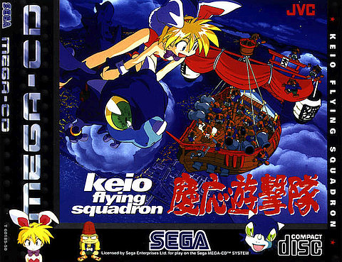
I also remember this cover really catching my eye when it was on the shelves because of that badonkadonk. 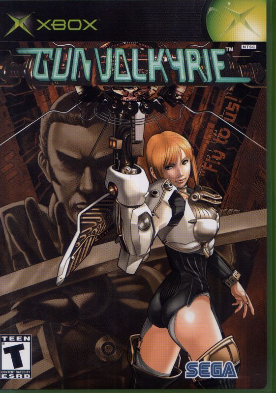 Fun fact the dude who created Sonic's pal Tails was the character designer for this game. Guess you could say he has a penchant for distinctive rears |
|
Deleted
Deleted Member
Posts: 0
|
Post by Deleted on Dec 8, 2015 19:31:56 GMT -5
I like the box of Metal Gear Solid 4. It's just a strong piece, with Old Snake's face dominating the cover with him having a suspicious sideways look at something that we can't see. I also like the similar box to Shin Megami Tensei: Nocturne, with the blood-red coloring and Demi-Fiend's face dominating the cover. I think that the PAL version uses a gorgeous dark blue instead of red, which is also quite nice. Interesting to hear someone say that about MGS4. I actually found the box art incredibly uninspired for that game. Wow. It's Snake. Look at how "realistic" he looks. Just seemed like they thought the only way to reach the mainstream crowd was by trying to hype the graphics on that one. |
|
|
|
Post by GamerL on Dec 8, 2015 19:45:05 GMT -5
I like the box of Metal Gear Solid 4. It's just a strong piece, with Old Snake's face dominating the cover with him having a suspicious sideways look at something that we can't see. I also like the similar box to Shin Megami Tensei: Nocturne, with the blood-red coloring and Demi-Fiend's face dominating the cover. I think that the PAL version uses a gorgeous dark blue instead of red, which is also quite nice. Interesting to hear someone say that about MGS4. I actually found the box art incredibly uninspired for that game. Wow. It's Snake. Look at how "realistic" he looks. Just seemed like they thought the only way to reach the mainstream crowd was by trying to hype the graphics on that one. Yeah, I hate the cover for MGS4, especially compared to the covers of 2 and 3. |
|
|
|
Post by Dee Liteyears on Dec 8, 2015 20:40:11 GMT -5
|
|
|
|
Post by 16bitter on Dec 8, 2015 22:09:03 GMT -5
There is a serious lack of DOOM in this thread.

|
|
|
|
Post by GamerL on Dec 8, 2015 22:20:11 GMT -5
|
|
|
|
Post by Resident Tsundere on Dec 9, 2015 4:40:33 GMT -5
I also like the similar box to Shin Megami Tensei: Nocturne, with the blood-red coloring and Demi-Fiend's face dominating the cover. I think that the PAL version uses a gorgeous dark blue instead of red, which is also quite nice. You are thinking of the japanese box art there. The PAL one uses a completely different demifiend artwork (and puts Dante beside it) My mistake. ^^; -The boxes for Devil Summoner: Raidou Kuzunoha games are nice. -While I find the game sadly mediocre, I kind of think that the cover for Silent Hill Homecoming is kind of cool and ominous. I also like the first Silent Hill's box art, even if it is a bit busy. And then, on the inside of the jewel case (underneath the disc, I think), there's a picture of Dahlia! Truly, the face of horror. -The box for Tactics Ogre: Let Us Cling Together is cool with all of its ornate characters floating around. -The minimalist box for Kingdom Hearts: Birth by Sleep stands out to me. -I like the box for Deus Ex. -The box for Theatrhythm Final Fantasy: Curtain Call is freakin' adorable! May as well lump in the boxes for Kirby games in terms of cuteness as well, even though they try to make him look hardcore on the American versions. -Ayami Kojima's Castlevania box arts.  -Similarly, any box art done by Shinkiro. -I'll confess: the only reason why I got the PS3 version of Catherine is because I liked that version's box better than the Xbox 360's.  |
|
|
|
Post by hummy on Dec 9, 2015 12:01:26 GMT -5
I think that the emphasis on nature in Secret of Mana's box art was quite nice considering the game's themes, although the image unfortunately got cropped out for the international releases.  Nothing else comes to mind, honestly. I ran an image search of random boxes, but the majority really just looks uninspired. |
|
|
|
Post by personman on Dec 9, 2015 17:57:06 GMT -5
The answer is clearly Phalanx:  But in all seriousness, some I really like are as follows:  I just like how it looks like the cover of a book.  Kinda typical of a shooter but it stands out to me thanks to who I am assuming is the pilot, trapped behind some kind of tech wall thing. It's almost surreal.  Simple, I know but that's not always a bad thing. I love the painted look and honestly the Vic Viper is the best fictional fighter craft ever so its enough for me.  I may be alone on this one but I really dig this cover. I guess its mostly because I'm a bit of a nut for fictional fighter craft and what not so having these all lined up show room style with the blank background is pretty eye catching to me. A shame it was ruined by that nasty yellow border in the US release.  I like this one because it has an artsy look to it but its also a 100 percent accurate representation of the gameplay. Both form and function. Awesome.  I seem to enjoy it when things put on a mask to make themselves look like other media. In this case it makes me think of the cover to a kids movie or something and it just makes me nostalgic for all the tons of cartoons I had on VHS when I was little. |
|
|
|
Post by Kubo Caskett on Dec 9, 2015 18:10:09 GMT -5
The answer is clearly Phalanx: I'm going to be honest, that cover art cracks me up and brings a smile to my face. In fact, I can imagine him jammin' to that Choco Mountain song from Mario Kart 64. |
|
|
|
Post by GamerL on Dec 9, 2015 19:45:45 GMT -5
I like this one because it has an artsy look to it but its also a 100 percent accurate representation of the gameplay. Both form and function. Awesome. I can't believe SOTC is a decade old now, wow. Anyway I can't believe I forgot to mention the cover of American McGee's Alice  Once not long after the game came out, I was 11 years old and wandering around Wal-Mart early in the morning with my mom, I was in the computer game aisle when I stumbled upon this and could not stop gawking at it, it scared the crap out of me and yet it was one of the coolest things I had ever seen, I never could have imagined a "dark, twisted" take on Alice In Wonderland at that age and yet it made perfect sense. Unfortunately my family did not own a computer at the time, let alone one that could have run the game, I didn't get around to actually playing Alice until 2007, by then it was dated but still cool, I like that game a lot and the sequel's not bad either. |
|
Deleted
Deleted Member
Posts: 0
|
Post by Deleted on Dec 10, 2015 12:40:18 GMT -5
|
|
|
|
Post by wyrdwad on Dec 10, 2015 19:10:17 GMT -5
I can never find a high-res image of this cover art online, which is a shame since the level of detail here is *insane*, and is the reason this remains my favorite box art of all time. 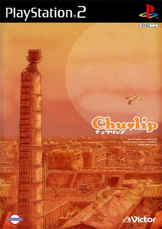 That's the Japanese box art for Chulip. Not to be confused with the American box art, which... shall we say... would NOT make this list.  I've also been doing a lot of MSX gaming lately, and I gotta say, the box arts for Psycho World and Xanadu are both among the most gorgeous I've seen in a long time. I mean, the Psycho World box is just plain badass-looking:  And Xanadu's is full of '80s fantasy awesomeness:  A lot of Falcom box art is amazing, in fact. Pretty much every Brandish game qualifies, and Sorcerian is simply gorgeous:  -Tom |
|
|
|
Post by personman on Dec 10, 2015 20:13:22 GMT -5
The best 200 list made em think of a couple other covers I really liked.  I just love the composition and the colors. The Wii port technically is more striking but I just don't like it as much.  Flipping perfect. A simple image with a ton of impact, and it makes me laugh. All of which perfectly represents the game itself. I need to play this one day, ha. |
|
|
|
Post by Colonel Kurtz on Dec 11, 2015 8:20:05 GMT -5
Classy, mysterious and dangerous. Plus a formally perfect kanji.  |
|