|
|
Post by Colonel Kurtz on Sept 18, 2016 6:42:05 GMT -5
I happened upon this today, and after my "portables as objects" thread, I couldn't not create a larger thread that includes non-portable consoles also. And this top 10 video is so wrong in so many ways, it should get your blood boiling, and incite you to tell us which consoles are the best-looking ones! (just look at this video's top ten and let your otaku's rage do the rest...
|
|
|
|
Post by Colonel Kurtz on Sept 18, 2016 8:26:41 GMT -5
I love the Mega Drive. It is so strange, with its volume control on the macine, and it is clear to me that the central circle was a CD reminder, as that still said power and future at the time. The black colour was just perfect, and the big 16-BIT was too cool. Unfortunately, the american version had a "Genesis" logo which completely drowned the design. The European version, named Mega Drive, too, Didn't have this problem. Ah, I'm not talking about the Mega Drive/Genesis mark 2. That one was not interesting.  On the left: uber cool. On the right, meh. |
|
|
|
Post by elektrolurch on Sept 18, 2016 8:42:56 GMT -5
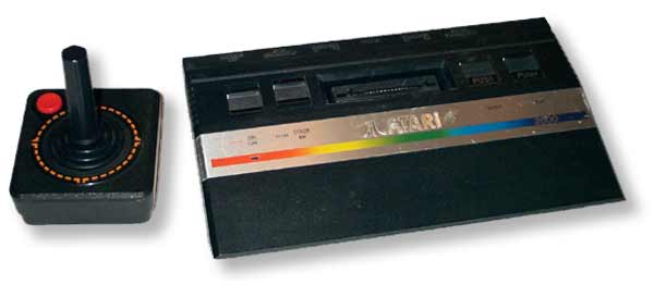
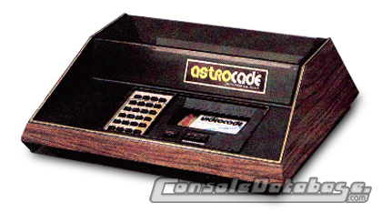
I think this is a very hard question and any answer could be valid because it is so subjective. I love for instance the old original Atari 2600 design as well as the later 2600 Jr. The 5200 and 7800 I don't like as much,though, but the amazingly small and slim 2600jr is just amazing for me somehow.  And in general, I love late 70ies style consoles with wood all over it. Bally Astrocade, anyone?  |
|
|
|
Post by zerker on Sept 18, 2016 11:06:32 GMT -5
Does cute count? Because I am quite fond of this little guy:  |
|
|
|
Post by Colonel Kurtz on Sept 18, 2016 11:51:52 GMT -5
yes cute counts. Otherwise there would never have been a Japanese PC-Engine!
I understand that your choices are completely subjective, and that is the very reason why this thread should be given a chance: when you wanna talk about a slick console, explain yourself! Give us your reasons! Lots of text!
Also, a jpeg of the console you chose is of course indispensable!
Loong texts, and a pic. That's what a post will look like in this thread.
|
|
|
|
Post by alphex on Sept 18, 2016 12:07:24 GMT -5
I much, MUCH prefer the EU/JAP design of the SNES:  It has aged somewhat - I'm happy that the "everything must be round!" trend of the mid 2000s is over and stuff can now be stacked again - it still has a great sense of childhood to me. It's colourful, it's soft in appearance (the NES was a bulky mofo), and it has a certain flow of dynamic to it (especially considering the controler). While Microsoft builds consoles that are influenced by car designs, the SNES was more akin to a spacecraft IMO - about dynamics. |
|
|
|
Post by wyrdwad on Sept 18, 2016 12:12:50 GMT -5
My answer is kind of boring and unpredictable, but like pretty much the rest of the gaming world, I've always thought the Super Famicom was the sleekest and prettiest of all consoles. From the classy grayscale color scheme, to that satisfying power toggle that makes its distinctive "clonk" sound when you flick it, to the eject button (something every cartridge console should have) that just screams, "Push me!", to the simply beautiful controller (the first game controller I ever noticed for its ergonomic feel), it's just a beautifully designed piece of hardware all around. The one place where my opinion diverges from the rest of the gaming world, though... is that I also like the looks of the American Super Nintendo just as much! The system didn't need a redesign, by any means, but the redesign it got was quite classy in its own right, adding a touch of violet to the color scheme, giving the system a few more contours than it had previously (subtle ones, but they look good!), and changing the toggle buttons to these strange yet interesting rectangles that still make the same satisfying "clonk" sound when switched, with a still-just-as-satisfying eject button as well (maybe even more satisfying, since this one is bigger and sinks down into the system more visibly!). Even the redesigned controller isn't bad, since I like the two shades of purple a lot (in fact, I think I actually prefer the color scheme on the American controller!), and I also prefer the American Super Nintendo logo with its tall-ass letters. It all just looks very... sleek, to me. Here they are side-by-side, lookin' gooooooood:  -Tom |
|
|
|
Post by Colonel Kurtz on Sept 18, 2016 12:32:03 GMT -5
I don't know how many people prefer the US design. I guess nostàgia plays a role here... Personnally, i prefer the Super Famicom design, but both are, as you say, pretty cool. What I love about it is that you feel the weight of the machine; there is no empt space inside the machine, and that gives it a sense of power, a sense of it being the best that coud be done at the time, with such a small console. It's a nice one.
|
|
|
|
Post by kaoru on Sept 18, 2016 12:32:32 GMT -5
That Top 10 video isn't that bad. Sure, the Atari 2600 and Gamecube have no place on a list like that, and I'm not sure why they'd lie and put the ugly-ass American SNES there instead of the Japan/Pal one, and the PS2 on #1 is too high... you know, whatever. I like sleek modern designs, so besides the Vita already mentioned in the previous thread, when it comes to non-handhelds I do really like the Wii, vertically standing, white, and with the cool blue light on it, alternatively in black like mine, it fits decoratively everywhere. If I could only choose a console that actually looks like a gaming system at first sight, not some decorative rectangle like every console of the past decade, I'd probably go with the Dreamcast.  |
|
|
|
Post by wyrdwad on Sept 18, 2016 12:44:35 GMT -5
I was thinking about this a bit more since posting my earlier vote for the SFC and SNES, and realized that in general, I'm not a huge fan of the way most game consoles look -- which makes the SFC/SNES something of an oddity. To figure out why this might be, I decided to sit down and think about what other consoles look cool to me, and only one other came to mind... and it's debatable whether or not it even qualifies (though I use mine AS a console, hooked up to my TV and devoted solely to playing video games on cartridge, disk, and cassette, so I feel it counts!): The Panasonic FS-A1ST MSX Turbo-R.  I've been kind of obnoxious about my MSX obsession lately (it's OK, I'm well aware!), but I really have been enjoying my system a lot. The thing is, mine isn't the one pictured: I have the slightly lower-end FS-A1WX MSX2+, which looks very similar but in an all-black color scheme, and I just don't think all-black looks anywhere near as cool. For me, the trend toward black consoles has made most consoles blend together aesthetically in my head. And when consoles buck that trend, they tend to just go all-white instead, which is just as boring IMHO. The FS-A1ST, on the other hand, goes grayscale like the SFC, and just does it in the classiest-looking way possible: a solid gray finish with white regular keys and gray-shaded function keys on its keyboard, a two-tone darker gray backboard, and freaking GOLD lettering all throughout, with the function display panel ALL in gold. It's absolutely gorgeous to me, and should my FS-A1WX ever die on me (which I certainly hope never happens, but it's inevitable it will eventually!), this is the system I'd like to replace it with, if I can find one. In a sea of video game consoles that really don't excite me with the way they look, the SNES, SFC, and this particular model of MSX Turbo-R are definitely my three favorites, and the reason why all comes down to GRAYSCALE, baby!  -Tom |
|
|
|
Post by Colonel Kurtz on Sept 18, 2016 12:46:38 GMT -5
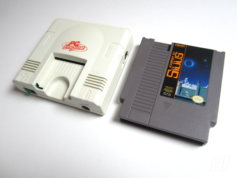
To answer Zerker's question about cuteness, I present the NEC PC-Engine, which was so small it could fit in the palm of your hands, and all the games came in cards, to save even more space. And the machine was able to play Street Fighter 2!!! Now, that's the power of cuteness at work!  Yes, the NES cartridge was just as big as the PC-Engine! |
|
|
|
Post by alphex on Sept 18, 2016 13:35:26 GMT -5
Actually, come to think of it... could the ridiculous (no matter how functional) look of the N64 controllers have played a role in its downfall vs. the PS1? It certainly did NOT look sleek and mature, which is something the PS1 prided itself on (even if a lot of its demography were "rad teens").
|
|
|
|
Post by X-pert74 on Sept 18, 2016 14:44:41 GMT -5
The PS2 is one of the least visually attractive consoles I've ever seen. I truly don't get its appeal. While these sorts of topics are totally subjective, I might put it near the bottom of my list... definitely not at first place, at any rate. Geez.
I love the US Super NES design <3 The purple is totally cool. Also, I think the Wii, Dreamcast, gray Japanese Saturn, and N64 look cool.
|
|
|
|
Post by 🧀Son of Suzy Creamcheese🧀 on Sept 18, 2016 15:25:54 GMT -5
My personal top 10 in no order (consoles):
-SNES (SFC or EU design)
-PS3
-PS4
-GCN
-Mega Drive
-Sega Saturn
-Wii
-Atari 2600
-Wii U
-Intellivision
As for ugliest (why not), PS2 fat, Xbox original and the SG-1000 comes to mind.
|
|
|
|
Post by wyrdwad on Sept 18, 2016 15:38:32 GMT -5
The PS2 is one of the least visually attractive consoles I've ever seen. I truly don't get its appeal. While these sorts of topics are totally subjective, I might put it near the bottom of my list... definitely not at first place, at any rate. Geez. I completely agree. The only thing I *will* give the PS2 is that its design is very malleable: not only can you stand it on its end if you want to, you can also lay it flat and stack other consoles on top of it, due both to its squared-off form-factor and its EXTREMELY solid build quality (the Wii is technically squared-off too, but it feels "delicate," to the point where I would never be comfortable stacking anything on top of it). So while the PS2 may be one of the ugliest consoles, it makes up for its aesthetic flaws with a high level of design functionality. The PS4 is similar, in that you can easily stack other systems on top of it -- and the PS4 also *looks* pretty decent, so it definitely feels like Sony learned from their past design decisions. -Tom |
|