|
|
Post by dire51 on Nov 3, 2010 18:28:40 GMT -5
Thanks to an unrelated thread on my board, I think I've finally uncovered the inspiration for the (frankly disappointing) U.S. The Guardian Legend boxart. Here, you be the judge: 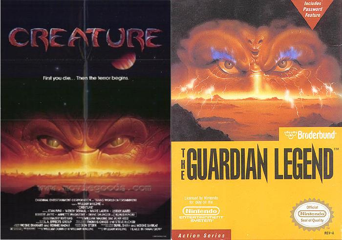 Creature Creature (1985) |
|
|
|
Post by aganar on Nov 3, 2010 18:37:23 GMT -5
Interesting.
But what made you decide it needed an "inspiration" in the first place? Was the boxart designer known for plagiarism or something?
|
|
|
|
Post by kitten on Nov 3, 2010 18:48:59 GMT -5
Lots of NES games had nearly plagiarized covers, so it's no surprise that Guardian Legend did. I really miss those old covers a lot, actually, they had this really kitschy value to them  |
|
|
|
Post by dire51 on Nov 3, 2010 19:25:18 GMT -5
Interesting. But what made you decide it needed an "inspiration" in the first place? Was the boxart designer known for plagiarism or something? I have no idea who the box art designer for Broderbund was, but the two pieces of art look so similar that it can't be a coincidence. I used the word "inspiration" because it doesn't appear to be a direct lift from the Creature poster, unlike the cover of Contra, for example, where the artist directly lifted Schwarzenegger's body from Predator's poster and placed Bill's head on it. |
|
|
|
Post by Lee on Nov 3, 2010 19:36:31 GMT -5
I like the European box art. It is simple but fits the game. 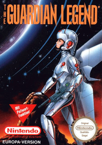 |
|
|
|
Post by evilakito on Nov 3, 2010 23:35:18 GMT -5
Yeah, the European box art is the best by far, even though she looks nothing like that in the game. Even the Japanese box art is completely off.
|
|
|
|
Post by X-pert74 on Nov 4, 2010 3:09:30 GMT -5
The American box art looks nearly identical to that poster. It's not exactly the same, but I really doubt the artist for the American cover was not inspired by that movie poster.
I too like the European cover a lot, even if it differs still from what the main character actually looks like.
|
|
jp
Junior Member

Posts: 62
|
Post by jp on Nov 4, 2010 12:52:10 GMT -5
You guys really like that European art best? That's the worst of the bunch, in my opinion. Seems like something some dude with a mullet and meth teeth would airbrush on a T-shirt for you at the county fair for 15 bucks. I think the H.R. Giger-esque Japanese box art works best. The techno-organic style seems most appropriate for a game about a living planet and a girl who is also a spaceship.
|
|
|
|
Post by X-pert74 on Nov 4, 2010 16:20:23 GMT -5
I just looked at the Japanese boxart again to refresh my memory, and I think it's good, but the European artwork is still my favorite.
|
|
|
|
Post by aganar on Nov 4, 2010 21:43:09 GMT -5
Just for comparison: 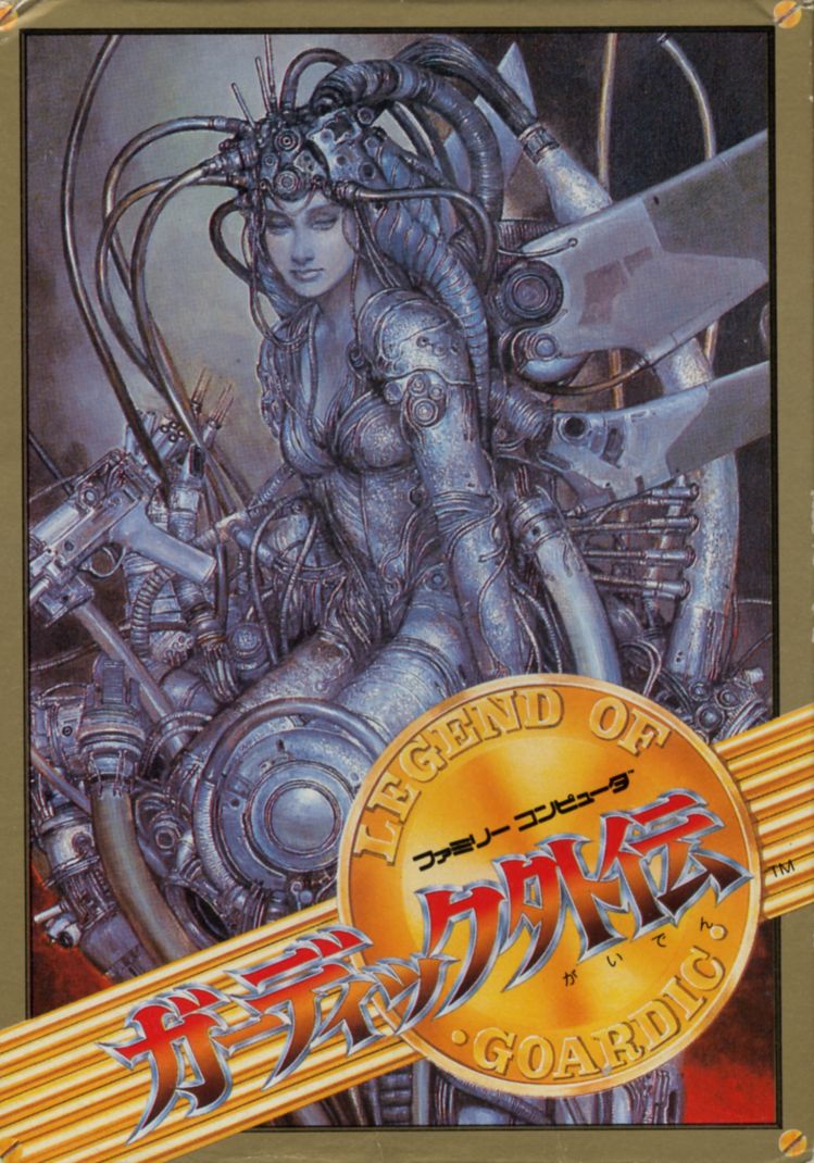 |
|
jp
Junior Member
Posts: 62
|
Post by jp on Nov 5, 2010 14:03:22 GMT -5
Yeah, see, that's great. It's like the original Amano illustration of some optional superboss from a 16-bit Final Fantasy.
|
|
|
|
Post by Jave on Nov 5, 2010 14:06:30 GMT -5
That box art would've given six year old me nightmares.
|
|
|
|
Post by Ryu the Grappler on Nov 5, 2010 14:22:19 GMT -5
The Famicom box art looks like artwork done by that Nintendo Power artist who did the art for the Zelda: A Link to the Past and Secret of Mana strategy guides.
|
|
RT-55J
Junior Member
Posts: 56
|
Post by RT-55J on Nov 5, 2010 16:33:43 GMT -5
LEGEND OF GOARDIC
|
|
|
|
Post by Wildcat on Mar 17, 2011 9:20:33 GMT -5
Hopefully a thread resurrection is okay, as I wanted to point out that the Japanese box art was done by Naoyuki Kato, who works for Studio Nue (scroll down a bit on the link to see where I got this from). They've made Macross, Space Battleship Yamato, and The Vision of Escaflowne, among others, and also helped From Software with their Armored Core games and contributed to Platinum Games' Infinite Space, too. I like the Japanese box the most myself. While none of them quite sync up to Miria/Alyssa's design in the game, it's the most interesting to me. |
|


