|
|
Post by Sketcz-1000 on Apr 5, 2012 9:44:48 GMT -5
|
|
|
|
Post by ReyVGM on Apr 5, 2012 11:31:31 GMT -5
You're being kinda thick-headed about this. I'm really hard-pressed to find ways to make this simple fact even more clear: Actual colors don't exist in software. Only numbers. Those numbers are interpreted by the graphics chip and the screen, and only then become represented as colors. I'm not being thick-headed. No need for quasi-insults. I know actual colors didn't exist in the software, that's why I said the screens should be white, black, grey because those are the default "colors/shades" interpreted by default by the system (be it GB, GBPocket, SGB or GBplayer). Now, the reason why you are seeing them as green/yellow on a GB or silver on a GBPocket is because that's the tint of the screen. It's not that the actual system outputs a green/yellow color, but because the actual screen is green/yellow. If you were able to remove the GB screen from a Game Boy and put a modern true-color screen, the games will NOT look green, they would look white, black and grey, just like they look by default on a Super Game Boy, assuming the game doesn't have a pre-determined color or SGB enhancements. But fine, you have your way of thinking and I have my way. You say to put the screens with the color the system gives them, I saw to put them with the color (or lack of) the games have by default. |
|
|
|
Post by ReyVGM on Apr 5, 2012 11:43:52 GMT -5
Nintendo however, has something for you.... On the back of the box for the USA Super Mario Land, the images shown are yellow, but on the Japanese version, they are white  And you know what else? No green.I haven't found a GB box with green images on the back. If there are any on some obscure Japanese game box, then they probably used a camera to take the screen from an actual GB screen (like magazines did) and not from a dev kit. So if you're going to go with one, then pick either white or yellow because those are the ones Nintendo officially used. |
|
|
|
Post by ReyVGM on Apr 5, 2012 11:47:29 GMT -5
Now, don't get me wrong. I would rather have green/yellow purely out of nostalgia, but white, black and gray are the actual "colors" the games have. And I always like to go with how the games really look "internally" and not how the TV/LCD made them look. Which is why I never take screenshots with scanlines or filters.
Don't GB games appear as white, black and gray on the Virtual Console? Are you able to choose the tint?
|
|
|
|
Post by Narushima on Apr 5, 2012 11:51:36 GMT -5
About the page you created, Sketcz (nice work by the way), I have to say I still prefer the stark black and white, or maybe the greyscale. The non-white OFF pixels look more "dirty" than "warm" to me. It looks like there is a filter in front of the picture and is quite unpleasant to the eye.
I seriously can't recall from my childhood anything that looked green or yellow on a Game Boy. I wish I could check but I only have a Color and Advance.
|
|
|
|
Post by ReyVGM on Apr 5, 2012 11:56:52 GMT -5
About the page you created, Sketcz (nice work by the way), I have to say I still prefer the stark black and white, or maybe the greyscale. The non-white OFF pixels look more "dirty" than "warm" to me. It looks like there is a filter in front of the picture and is quite unpleasant to the eye. I seriously can't recall from my childhood anything that looked green or yellow on a Game Boy. I wish I could check but I only have a Color and Advance. That's because when we played the actual GB system, we didn't look at the sprite of a piece of paper and think it was really green. We knew it was supposed to be white, but it looked green/yellow because the GB LCD screen made it look that way. When I played my old GB games on the Super GB I understood completely that the games were never green or yellow or silver, but white, black and gray. I saw them as green or yellow because of the LCD screen, but I knew it was white/black/gray all along. |
|
|
|
Post by Sketcz-1000 on Apr 5, 2012 12:14:01 GMT -5
This is my order of preference for the screens:
1, 2, 3, 6&4 tie, 5
Seeing them all side-by-side, I think we should reconsider the use of green, in favour of yellow, or perhaps gp by author preference?
|
|
|
|
Post by ReyVGM on Apr 5, 2012 12:32:00 GMT -5
Officially: it's either yellow or white. Yellow #1 and White #5 look nice.
Personally: it's white.
Internetz: green.
|
|
|
|
Post by derboo on Apr 5, 2012 12:58:10 GMT -5
If you were able to remove the GB screen from a Game Boy and put a modern true-color screen, the games will NOT look green, they would look white, black and grey The colors would be whatever the screen is built to interpret the values given by the system. There is no color without a screen. Nintendo however, has something for you.... On the back of the box for the USA Super Mario Land, the images shown are yellow, but on the Japanese version, they are white And you know what else? No green.Officially, Gateway to Apshai looks like this: 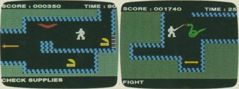 According to the official promo screenshots, Dead or Alive Dimensions runs in 800×480 resolution (in 2D mode). Colors on contemporary Game Boy promo screenshots are at the very least determined by the analog capturing device used, and very possibly also post-processed for better visibility. |
|
|
|
Post by Weasel on Apr 5, 2012 13:25:01 GMT -5
I'm voting for option 1, honestly. Not because it "looks the most accurate" or "is the default"; because it honestly looks the best to my eyes.
|
|
|
|
Post by ReyVGM on Apr 5, 2012 14:03:07 GMT -5
The colors would be whatever the screen is built to interpret the values given by the system. There is no color without a screen. Again, YES, but you are not putting shots of GB games played on a brick GB, you're putting shots of GB games period. And those GB games, by default on a non tinted screen are white, black and gray. The only way green colored GB shots would look good for someone is if they grew up playing with the brick GB. Other than that or nostalgia, I see no reason to have green-colored GB screenshots. That's why I say white would be the best one to use (even though I prefer green or yellow). Officially, it's either white or yellow. My guess that the GB dev kit or whatever they used to capture video had an option for a default color (white) or a yellow tinted mode. Probably not to clash with white pages of magazines. Officially, Gateway to Apshai looks like this: www.hardcoregaming101.net/dunjonquest/gateway-screenshots.jpgAccording to the official promo screenshots, Dead or Alive Dimensions runs in 800×480 resolution (in 2D mode). Colors on contemporary Game Boy promo screenshots are at the very least determined by the analog capturing device used, and very possibly also post-processed for better visibility. I'm not going to keep saying the same thing over and over. Obviously you have your own way or believing why the images should be green. But they should not because green was a "feature" of the original GB LCD screen, not of the games. When I see game images I want to see how the games really looked, not how the TV or LED screen made them look. Although, it wouldn't hurt to put a comparison image for informational purposes. |
|
|
|
Post by Weasel on Apr 5, 2012 14:15:04 GMT -5
Again, YES, but you are not putting shots of GB games played on a brick GB, you're putting shots of GB games period. And those GB games, by default on a non tinted screen are white, black and gray. The only way green colored GB shots would look good for someone is if they grew up playing with the brick GB. Other than that or nostalgia, I see no reason to have green-colored GB screenshots. You seem to be missing the point that there is no such thing as "default". When they make GB games, they do not work in "white" or "black" - they work in 0, 1, 2, and 3, where 0 is "unshaded" and 3 is "fully shaded". It's all a matter of interpretation, which is why we're holding this bloody poll in the first place. I'm alright with you having your opinion but at least try to be informed about it. |
|
|
|
Post by Sketcz-1000 on Apr 5, 2012 15:30:00 GMT -5
Is it a poll? See guys - this is why I don't like democracy. There'd be less fighting if someone just al forced us to accept it in inverted neon.
Seriously though, there's an extremely important no one has yet mentioned (or I missed it).
The GB, GB Pocket, GBC and even GBA were all reflected light. They did not project light like a TV or computer monitor (some specialist models did, but let's ignore those temporarily).
Whereas with these emulated screens, we're viewing them on monitors which project light, and if I can recall correctly from my days in magazines, they don't even project true colour - those kinds of monitors cost a fortune.
So ultimately whatever we use, it's only ever going to be a reasonable approximation of projected light mimicking what was reflected on an actual handheld (unless you had a backlit model).
After some thought, I'm inclined to think we should go with what shows the games at their very best, even if it's not necessarily authentic. I recall being given screens of Panzer Dragoon Saga for a print article, and they were at a higher/cleaner resolution than you would normally have. It wasn't historically accurate, but it made the game look gorgeous. And I have a feeling Derboo won't like this idea - because we've discussed PS1 screens and their proper resolution before - but even if we are being slightly inaccurate, or salient with the truth, surely part of our goal is to make these older games as appealing as possible?
Is this analogous to when they remaster films so they look better than they originally did?
I'm not sure. I'm not even sure we'll come to a consensus on this.
I think it's essential GB screens are at their correct native resolution (or possibly x2 without anti-aliasing), but how does everyone feel about the colour palette being chosen by the author, in case a consensus can't be reached?
|
|
|
|
Post by starscream on Apr 5, 2012 15:52:34 GMT -5
I think it's essential GB screens are at their correct native resolution (or possibly x2 without anti-aliasing), but how does everyone feel about the colour palette being chosen by the author, in case a consensus can't be reached? I agree with that (author's choice). I like to do that in general myself with monochrome systems where different screens were available (TRS-80, Amstrad PCW). |
|
Deleted
Deleted Member
Posts: 0
|
Post by Deleted on Apr 5, 2012 19:04:41 GMT -5
My favorite is definitely number 4:  It makes everything look like it was drawn with pencils, which is very pleasing to my eyes. Not only that, but it matches nicely with my vision of the original Game Boy being monochrome. No matter what palette you pick up in the end, as long as the palette is consistent and not like this, I'm happy:  |
|


