|
|
Post by Weasel on Feb 18, 2013 12:06:05 GMT -5
This post is going to be a bunch of links to Youtube, because the formation of the logo is nearly as important to me as the actual logo itself. Unsurprisingly, a lot of these come from the mid-1990's CD-ROM generation. - Interplay's 1996 logo, because nothing says elegance quite like etching your name in cursive on a giant block of marble, in space, with a laser. - Microsoft a la 1998, not so much for the logo itself, as for the awesome "space frontier" feel provided by the music. Holy shit, I just got shivers down my spine. - Capcom's 2008 logo from the Bionic Commando reboot; I admittedly haven't kept up with their recent output, but I think this one may have been a one-off. It's kind of cool how they pretty much give you an audio retrospective from 8-bit NES to modern days in all of eight seconds. The guitar strum at the end seals the deal. - Cyan's 1993 logo is just plain haunting. |
|
|
|
Post by Ike on Feb 18, 2013 12:19:25 GMT -5
|
|
|
|
Post by lanceboyle94 on Feb 18, 2013 12:36:30 GMT -5
Besides stuff like the classic Konami logo and the Sega logo, I also have to agree with the choice of Taito's logo. So goooooooood. And regarding EA I too quite like how they customize the logo for each game/series. I'm also quite fond of the older EA Games logo, mostly because CHALLENGE EVERYTHING. And we can't forget this:  Classic. And bobloblaw's mention of Eidos reminds me that I quite like both their logos (although there's a slightly older version of their first logo with smaller letters that doesn't look so good). I also like Crystal Dynamics' second logo (their most known one)  |
|
|
|
Post by The Great Klaid on Feb 18, 2013 15:14:33 GMT -5
Well, I have really no design sense, but I always know I'm in for a good time when I pop in an old game and see this  |
|
|
|
Post by Reiji-kun on Feb 18, 2013 16:21:37 GMT -5
 I'm not gonna lie, the music is about half of it. You have good taste, my friend. Come. I shall buy you a drink. |
|
|
|
Post by caoslayer on Feb 18, 2013 16:42:22 GMT -5
So iconic:  Then they ruined it and finally they stole Atari´s. |
|
|
|
Post by Scylla on Feb 18, 2013 16:59:50 GMT -5
Speaking of animations and sound, I really like how there are so many takes on the Sega logo screen in Genesis games (and on other Sega platforms too), and going back to the Konami logo, in addition to the classic 16-bit start-up screen, I also really like how they turned the logo into a little walking guy in their PlayStation FMV intro. And for something obscure and very recent, I like the Black Forest Games logo: 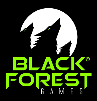 Especially for how it starts as a forest and transforms into howling wolves, as seen here: www.youtube.com/user/blackforestgamesteam |
|
|
|
Post by wyrdwad on Feb 19, 2013 23:38:09 GMT -5
|
|
|
|
Post by Allie on Feb 19, 2013 23:47:17 GMT -5
That first one was mentioned. Just not linked or hotlinked to. |
|
|
|
Post by The Great Klaid on Feb 20, 2013 10:19:22 GMT -5
So iconic: Then they ruined it and finally they stole Atari´s. That is a much older version than I'm acustomed to... |
|
|
|
Post by romanblade86 on Feb 20, 2013 11:18:54 GMT -5
I'll have to go for anything from SEGA.
|
|
|
|
Post by wyrdwad on Feb 21, 2013 1:56:42 GMT -5
Can't believe I didn't think of this one sooner.  Even before becoming obsessed with La-Mulana, I still really liked this logo. Especially when it's animated and you see the little pixel dude raise his sword triumphantly.  -Tom |
|
|
|
Post by brianc on Feb 21, 2013 2:15:45 GMT -5
So iconic: Then they ruined it and finally they stole Atari´s. I miss that logo. I don't disagree, but I'm quite fond of the original Atari logo (not so fond that Infogrames rebranded themselves with the Atari name). |
|
tengutenga
Junior Member
 EXTRA SUGAR, EXTRA SALT, EXTRA OIL AND ENERGY!!
Posts: 94 
|
Post by tengutenga on Feb 24, 2013 5:23:01 GMT -5
Plundered many times in history, I admire this logo for having survived all these years virtually intact from its premiere in 1972. Ladies and gentlemen,  There are many different interpretations of the "/|\" mark, but I think it's a first person view of a double roller coaster track. Atari games have been a roller coaster ride (both as in excitement and as in quality) as much as its corporate affairs. There are many different interpretations of the "/|\" mark, but I think it's a first person view of a double roller coaster track. Atari games have been a roller coaster ride (both as in excitement and as in quality) as much as its corporate affairs.
Since 1991, this mark has been the mark of the highest quality licensed mecha fanart you can get.  And now, my personal favorite. The calligraphic armadillo is just beautiful, and I feel the later version kills it in a way I describe as like a kid vandalizing a Renaissance painting with a Hello, my name is tag.  I think this logo is pretty badass. Maybe it is because it is associated with Langrisser, Assault Suits and of all things, Cho Aniki.  |
|
|
|
Post by wyrdwad on Feb 24, 2013 5:44:50 GMT -5
Playing through Corpse Party, I came to realize that I actually really like the Mages logo (Engrish aside): mages.co.jp/images/head_logo.png(Logo is black on a clear background, so it's better to click and view, since it doesn't show up properly embedded in this message.) Simple and effective. I also rather like the 5pb logo, even if I still don't quite get what "the five powered & basics" actually means.  -Tom |
|