|
|
Post by spanky on Nov 8, 2017 17:35:22 GMT -5
Oh I get it - one of the main reasons I became disillusioned with Nintendo during the N64 era was the near abandonment of 2D in both terms of art and gameplay. I'm totally glad we have these games around but it seems like for every modern game that does a great job of emulating 8 or 16 bit style (like Mega Man 9), it seems like there's tons of crap like...I dunno, Retro City Rampage which is just like "HEY!! IT'S OLD! GET IT?" Makes me wonder if we'll begin to see throwbacks to the primitive 3-D polygons in early Playstation and Sega Saturn games. A lot of it has not aged well in my opinion. King's Field, Battle Arena Toshinden, Tokyo Highway Battle. Though I think they have some charm, they might be a bit rough on the eyes for younger generations of gamers. I'm sorta surprised the chubby low poly models against detailed pre-rendered background aesthetic of Final Fantasy VII hasn't been revisited. Or maybe it has and I just haven't noticed. |
|
|
|
Post by Bumpyroad on Nov 9, 2017 1:35:47 GMT -5
Makes me wonder if we'll begin to see throwbacks to the primitive 3-D polygons in early Playstation and Sega Saturn games. A lot of it has not aged well in my opinion. King's Field, Battle Arena Toshinden, Tokyo Highway Battle. Though I think they have some charm, they might be a bit rough on the eyes for younger generations of gamers. Games like Banned Memories: Yamanashi have been slowly inch-worming that way, but i don't think it's gonna explode into something huge - it's too ugly to be worth taking inspirations from. |
|
|
|
Post by Snake on Nov 9, 2017 12:46:39 GMT -5
Makes me wonder if we'll begin to see throwbacks to the primitive 3-D polygons in early Playstation and Sega Saturn games. A lot of it has not aged well in my opinion. King's Field, Battle Arena Toshinden, Tokyo Highway Battle. Though I think they have some charm, they might be a bit rough on the eyes for younger generations of gamers. Games like Banned Memories: Yamanashi have been slowly inch-worming that way, but i don't think it's gonna explode into something huge - it's too ugly to be worth taking inspirations from. Wow, that trailer has something of a Silent Hill 1 vibe. Kitsch, Syphon Filter quality graphics. Haha~ |
|
|
|
Post by X-pert74 on Nov 11, 2017 17:44:33 GMT -5
- I really love the look of the characters and settings of the Trails games - particularly Trails in the Sky. Trails of Cold Steel looks neat too, but I think that the character designs in it look a little more otaku-pandering than Trails in the Sky's designs did, for the most part. Also, I think the somewhat stylized 2.5D-ish look of Trails in the Sky in particular is really charming <3
- I think Resident Evil 4 looks cool. I like how moody and unnerving the village and castle are, and I love how freakish the monster designs are. Chief Mendez during his boss fight looks especially cool, like something out of The Thing <3
- Doom and Doom II look super amazing. They're scary and gory, but also over the top in kind of a cheesy fun B-movie way. I also find most old FPSes (that have 2D sprites on 3D-looking backgrounds) to be really charming. Doom 2016 also looks great, for different reasons.
- The Contra series looks amazing. I think aesthetically-speaking, I like the nostalgic old-school charm of the older games, as well as the more serious, gritty feel of games like The Alien Wars, Hard Corps, and Shattered Soldier. Shattered Soldier in particular looks amazing; I love how elaborate its setpieces are, and how enemies in it and Hard Corps vary from humanoid, to robotic, to grotesque.
- I like the abstract feel of the level designs in the first two Tony Hawk's Pro Skater games. The later games look good too, but as they moved to more powerful hardware, they gradually began to move toward more and more realistic-looking stages that happen to have perfectly-shaped quarter-pipes everywhere. The first two Tony Hawk games, however, look almost like you've been set loose in a semi-realistic dream world. Their levels (especially 1's levels) don't look so much like places that people would actually live or even exist in, but like they're spaces that inexplicably exist for the sake of the skater to skate around and do tricks in. Maybe that wouldn't appeal to everyone, but I like that. I especially like some of the more abstract elements I've seen in cut content for the first Tony Hawk, with how there were originally plans to have elements like a cloud you could ride on to be teleported to a hidden area, and whatnot.
- The Mario games generally look really nice to me. In particular, I love the pop-up book-esque design and aesthetic of the Paper Mario games, like The Thousand Year Door <3
- The Fire Emblem games look sweet. Some games' art I think looks better than others, depending on who their artists happens to be. I'm personally not a huge fan of most of the character designs in Awakening and Fates, but I love the Echoes artwork, as well as the artwork for older games like Sacred Stones and Path of Radiance.
|
|
|
|
Post by toei on Nov 11, 2017 17:56:00 GMT -5
I love that early 3D look. Sega Saturn / PSX CG cutscenes hold a special place for me too. I know I'm nearly alone in that category.
I like 2D Japanese RPGs with elongated / less SD characters, like Phantasy Star 4, Growlanser or the first two Suikoden.
EDIT - I'd check out that Banned Memories game, but that character model is uglier than anything I've ever seen on Saturn or PSX. Even the characters in the first Virtua Fighter looked better. Maybe the resolution is too high for the textures & polygon count?
|
|
|
|
Post by X-pert74 on Nov 11, 2017 19:06:02 GMT -5
Oh yeah, I really like the way that pre-rendered characters and backgrounds look in games like Donkey Kong Country, Fallout, and to a lesser extent Trails in the Sky. I cannot get enough of it; I think they're still graphically impressive as hell to this day. <3
|
|
|
|
Post by Bumpyroad on Nov 12, 2017 3:13:10 GMT -5
- The Contra series looks amazing. I think aesthetically-speaking, I like the nostalgic old-school charm of the older games, as well as the more serious, gritty feel of games like The Alien Wars, Hard Corps, and Shattered Soldier. Shattered Soldier in particular looks amazing; I love how elaborate its setpieces are, and how enemies in it and Hard Corps vary from humanoid, to robotic, to grotesque. Nobuya Nakazato has a great vision, a pretty unique way of seeing things in games, i like it too!   |
|
|
|
Post by 8 Bit Dreams on Nov 12, 2017 9:05:24 GMT -5
I love games that mix refined pixels and rudimentary polygons like Ginga Fukei Densetsu Sapphire and Karnaaj Rally. It feels like the missing link between the 16-bit and 32-bit era. I would love to find out about more games that are styled like this.
|
|
|
|
Post by toei on Nov 12, 2017 15:13:16 GMT -5
Oh, I like the PSX-era RPGs with 3D backgrounds and 2D sprites, too. Breath of Fire 3 comes to mind.
|
|
|
|
Post by elektrolurch on Nov 13, 2017 2:55:11 GMT -5
]Makes me wonder if we'll begin to see throwbacks to the primitive 3-D polygons in early Playstation and Sega Saturn games. A lot of it has not aged well in my opinion. King's Field, Battle Arena Toshinden, Tokyo Highway Battle. Though I think they have some charm, they might be a bit rough on the eyes for younger generations of gamers. We already see sruff like this: |
|
aaa
Banned
BANNED
Posts: 121 
|
Post by aaa on Nov 13, 2017 3:49:19 GMT -5
I love that early 3D look. Sega Saturn / PSX CG cutscenes hold a special place for me too. I know I'm nearly alone in that category. I like 2D Japanese RPGs with elongated / less SD characters, like Phantasy Star 4, Growlanser or the first two Suikoden. EDIT - I'd check out that Banned Memories game, but that character model is uglier than anything I've ever seen on Saturn or PSX. Even the characters in the first Virtua Fighter looked better. Maybe the resolution is too high for the textures & polygon count? You're not alone. Love that old look. And mannequin models in cutscenes. The DS has a bunch of games that look like that. |
|
|
|
Post by JoeQ on Nov 13, 2017 4:06:10 GMT -5
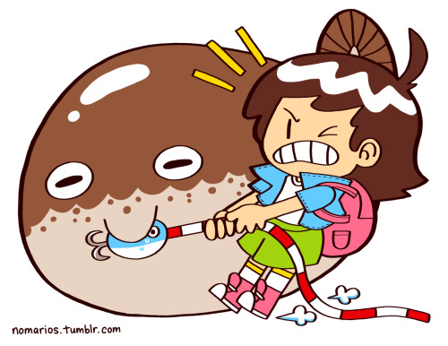
I'm a big fan of From Software's style. Most of their games have this very somber, dark and melancholy mood and tone. Most evident in King's Field, Armored Core and the Souls series. There's also often this sense of hopelesness and pointlesness. The world has already ended, all that's left is fighting over the meager scraps of the old world.
And then there's Cookie and Cream:
|
|
|
|
Post by Bobinator on Nov 13, 2017 11:13:05 GMT -5
So, I haven't posted here in a while. You know what's cool? There's a lot of games of a European origin on the Game Boy Color. And maybe it's just the talent involved, or the color pallete, but some of these games look like lost C64 games, and I think that's really neat. Tons of shading, a somewhat darker color pallete than you'd see on most GBC games... I don't know why, I just dig it.  On a somewhat similar tack, I've been digging through the DS's library, and something I find really neat is its particular brand of 3D. It's somewhat jaggier than the N64 was, so the 3D on it usually ends up looking like a PS1 game. I find this really cool, because it's like discovering 5 more years of PS1 games you never knew existed. (Legacy)-4.jpg) ![]() |
|
|
|
Post by Purple Moss on Nov 14, 2017 20:41:54 GMT -5
Let's see, these are some styles that have caught my eye: - Jeanne d'Arc (PSP): The anime art is too 2006 for my taste, but the 3D models are very charming ( pic). I also like them because I feel that an indie dev nowadays could totally make something like this, you know? Add some modern rendering tricks and you could get a pretty nice 3D game on a budget. Much better than a PS1 3D-style game (apologies! haha). - Earthboud, Ganpuru: Both are very colorful games (especially when compared to other SNES games!) full of lovely characters. Ganpuru's style is a bit more plain in comparison, but its animations are full of personality. - Yoshi's Island: Now this is a look I haven't seen copied anywhere else. Too bad, because it hasn't aged at all!
- The Last Remnant: The architecture featured in this game... I don't know what it is, but it is soooo refreshing. Not your typical European setting. Isn't FFXII's somewhat similar? I think it's some sort of Byzantine and/or Islamic style; with its own touch of fantasy, of course. A style more devs should explore. - Grand Knights History: I haven't played much of this (only played it a bit after the fan translation came out), but I love its presentation. Take a look. The handrawn map (seemingly illuminated by candlelight), the piece moving across the board, the stores' background, the vendor's portrait as it's colorized... it all feels right at home in the game's world. The music too, even if it's not particularly memorable. You can tell they put a lot of work in this. |
|
cacao
Junior Member

Posts: 69
|
Post by cacao on Nov 15, 2017 23:34:16 GMT -5
- Yoshi's Island: Now this is a look I haven't seen copied anywhere else. Too bad, because it hasn't aged at all! I love the way Yoshi's Island looks and I agree, it's really unique and has aged very well. |
|